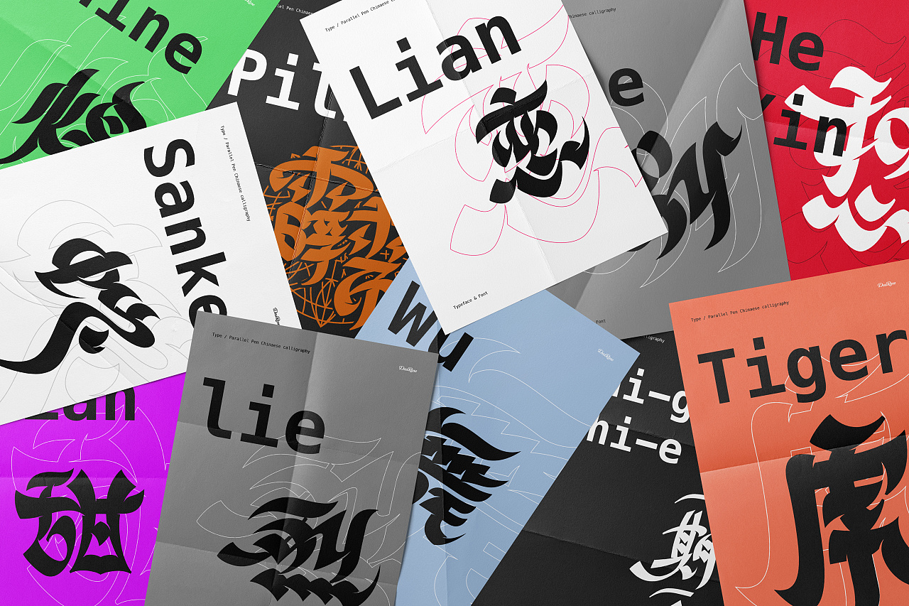
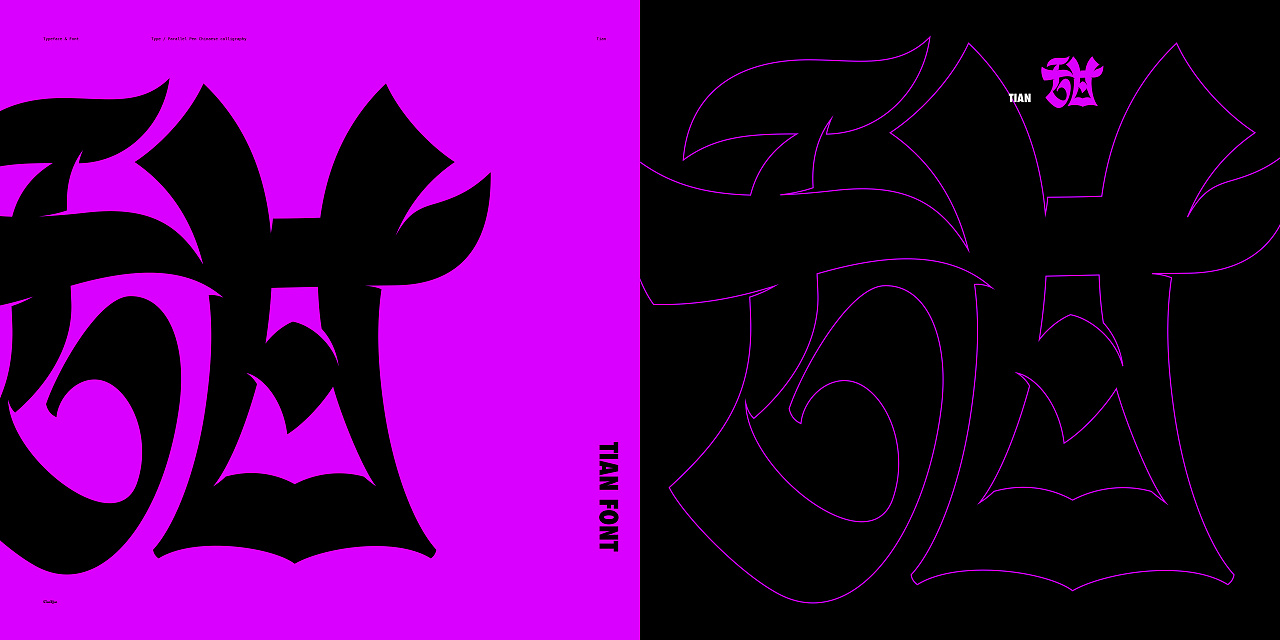
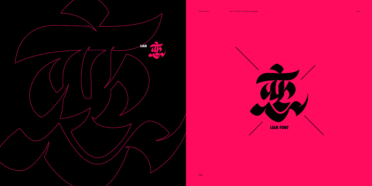
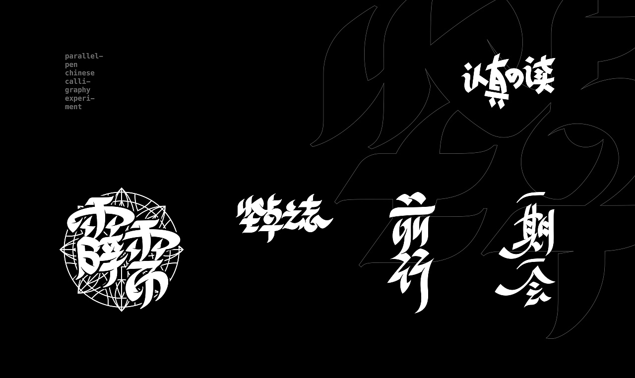
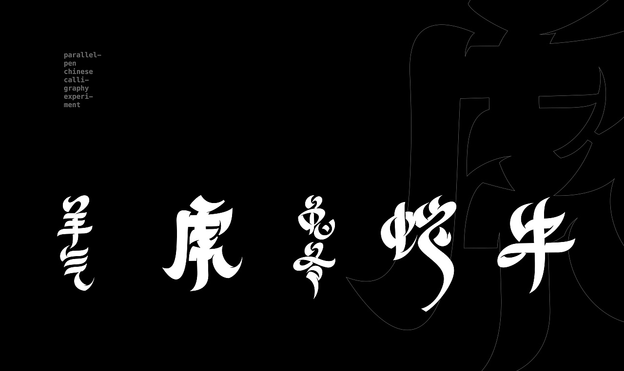
Parallel calligraphy 平行书

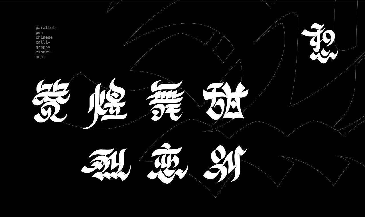
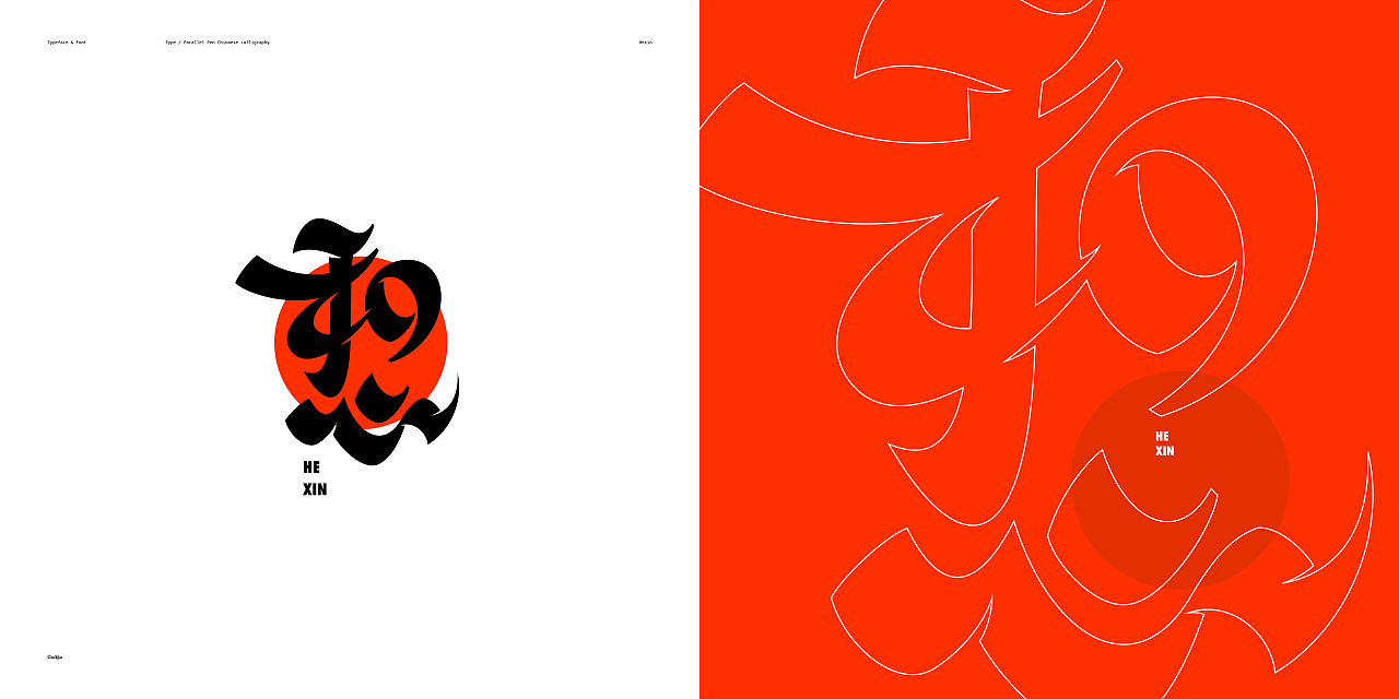
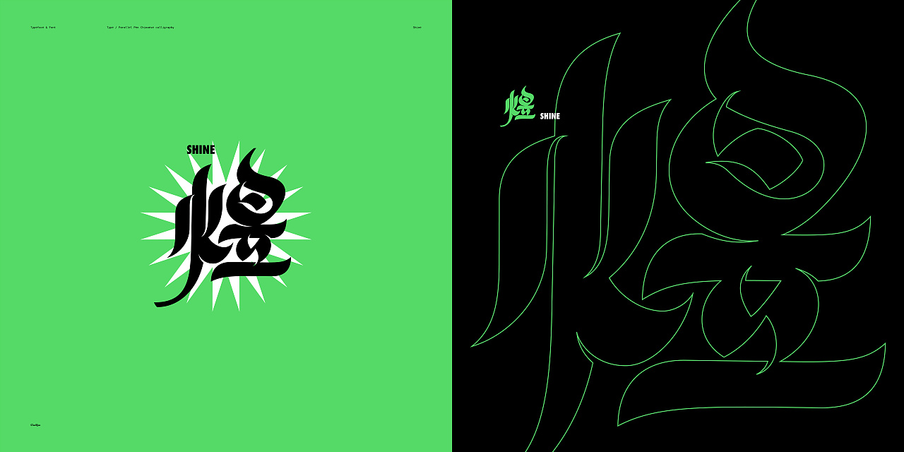
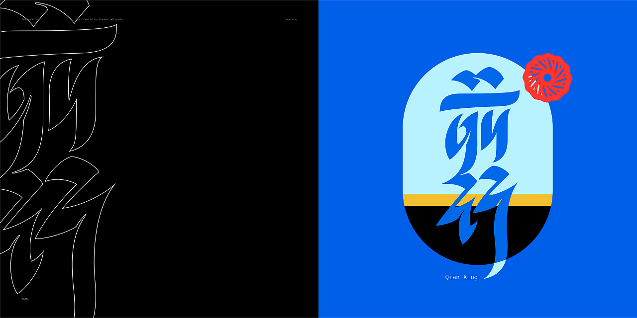
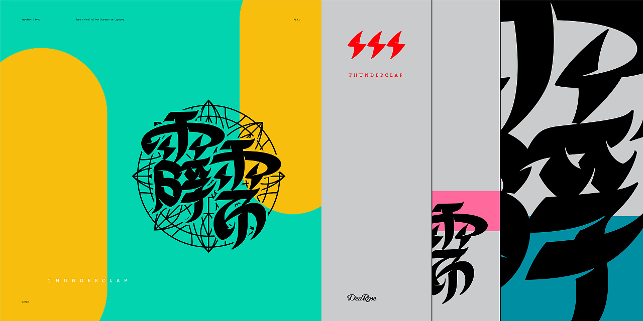
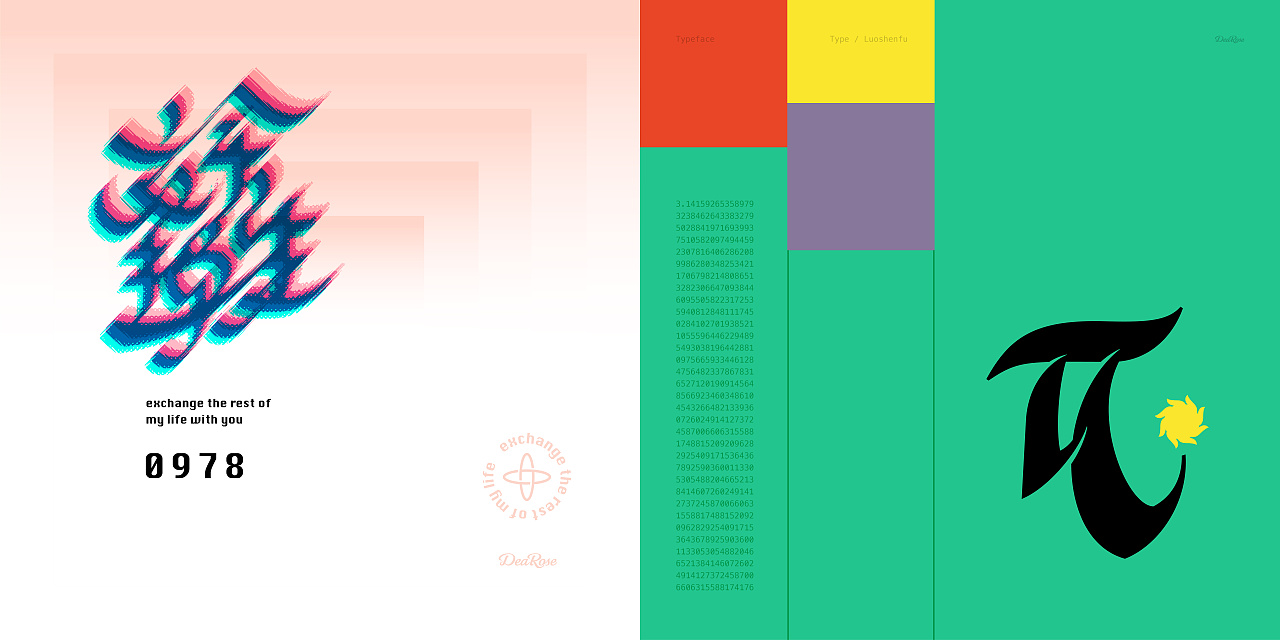
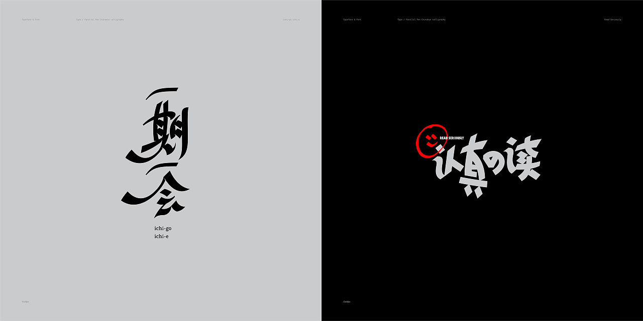
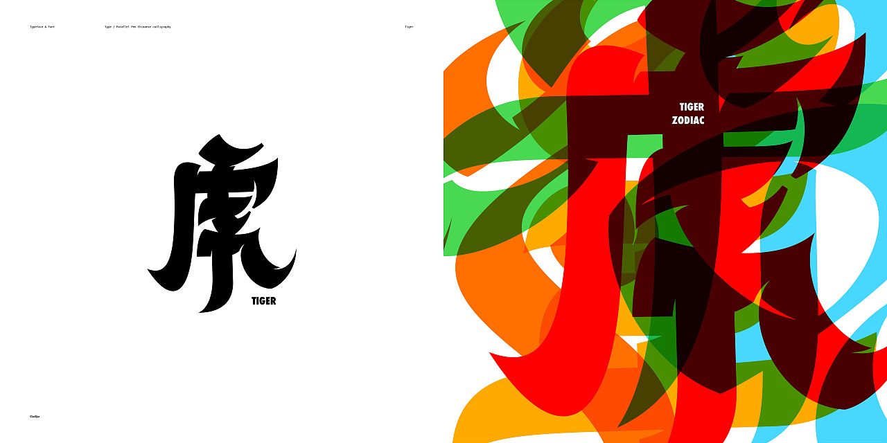
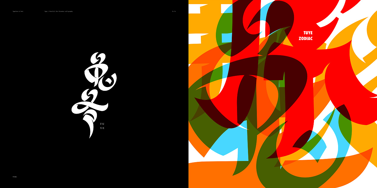
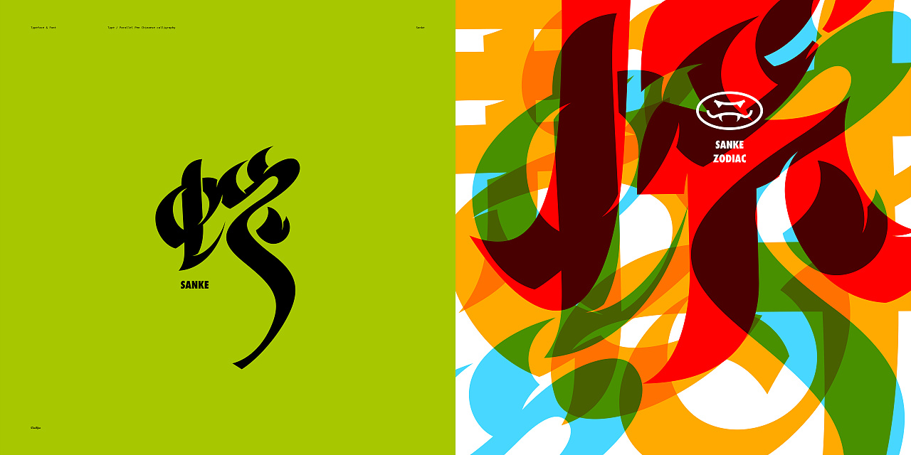
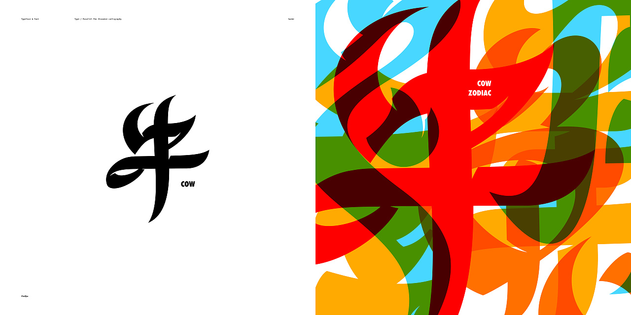
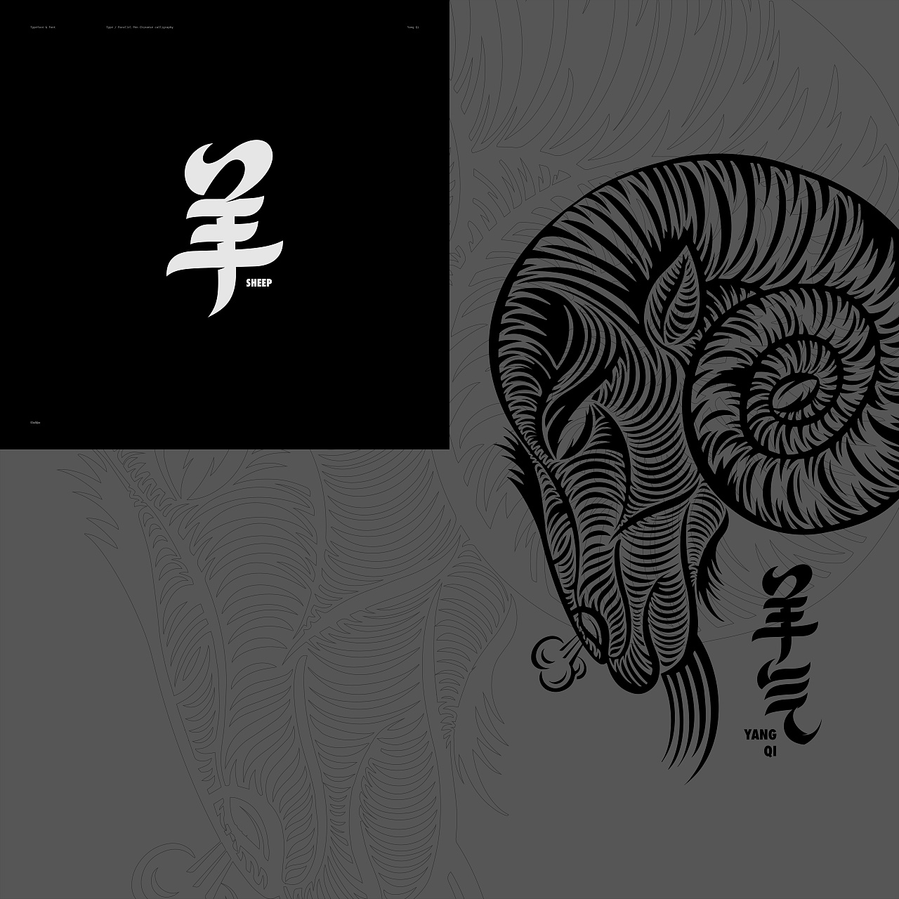
“平行书”以“汉字”的笔画顺序为基础,书写的艺术字体,它融入了平头笔(Parallel Pen)的特性和“汉字行书”的笔画特色。书写过程中有意保留“Roman Type”的书写感,探索一种新的表现方式。
—
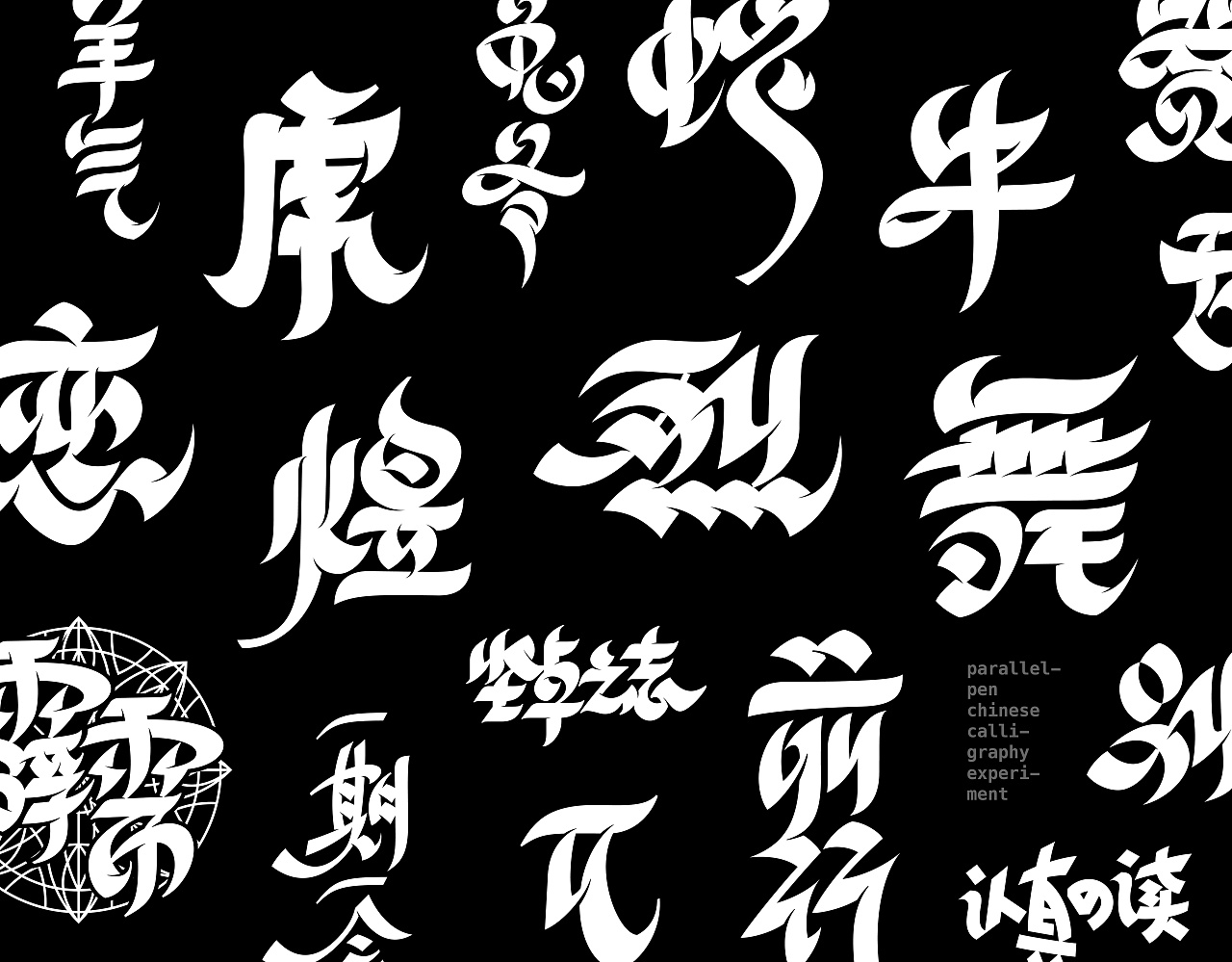
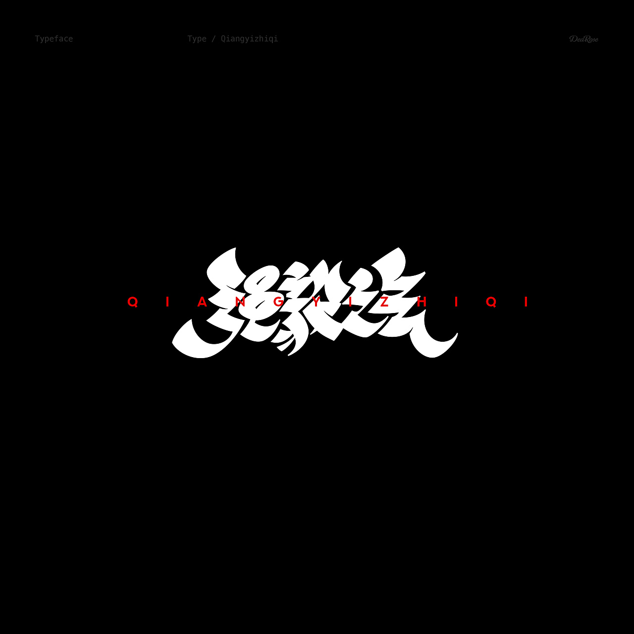
字形不追究刻意的极简,省笔连笔,强调独特的圆润的曲线与尖锐的笔锋。使用强烈的“软硬对比”营造流畅自信的书写节奏。
“行书”是汉字书法艺术的一种表现形式,也是我们日常书写最常用的方式,每个人的字写出来都是丰富多变的,将汉字书写与西方文字书写融合,“平行书”应运而生。
—
"Parallel calligraphy" is an artistic font based on the stroke order of "Chinese character". It combines the features of the Parallel Pen and the stroke features of "Chinese character running".In the process of writing, I intentionally retained the sense of "Roman Type" and explored a new way of expression.
—
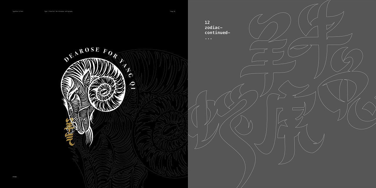
Minimalist was not intentionally pursued when writing, sometimes a cursive writing of strokes emphasized the unique round curve and sharp edge. Strong contrast between hard and soft strokes was used to create a smooth, confident writing rhythm.
"Cursive handwriting" is a form of expression of Chinese calligraphy art, and it is also the most commonly used way of our daily writing. Everyone's writing is different and changing, which also represents the unique aesthetic of Chinese people. The "parallel calligraphy" came into being by combining Chinese writing with Western writing.
—
©本字体已申请版权保护


—
字形不追究刻意的极简,省笔连笔,强调独特的圆润的曲线与尖锐的笔锋。使用强烈的“软硬对比”营造流畅自信的书写节奏。
“行书”是汉字书法艺术的一种表现形式,也是我们日常书写最常用的方式,每个人的字写出来都是丰富多变的,将汉字书写与西方文字书写融合,“平行书”应运而生。
—
"Parallel calligraphy" is an artistic font based on the stroke order of "Chinese character". It combines the features of the Parallel Pen and the stroke features of "Chinese character running".In the process of writing, I intentionally retained the sense of "Roman Type" and explored a new way of expression.
—
Minimalist was not intentionally pursued when writing, sometimes a cursive writing of strokes emphasized the unique round curve and sharp edge. Strong contrast between hard and soft strokes was used to create a smooth, confident writing rhythm.
"Cursive handwriting" is a form of expression of Chinese calligraphy art, and it is also the most commonly used way of our daily writing. Everyone's writing is different and changing, which also represents the unique aesthetic of Chinese people. The "parallel calligraphy" came into being by combining Chinese writing with Western writing.
—
©本字体已申请版权保护
服务方:个人创作
参与设计师:
合作单位:
举报
